"Coincidence"
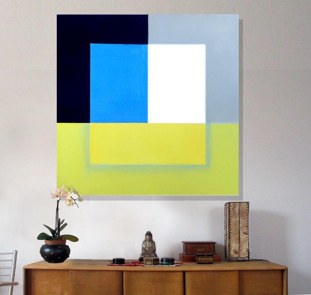


New minial piece created at my 2nd street studio NYC
Responses (1)

October 27, 2022
With echoes of Joseph Albers and Frank Stella, Robert Petrick’s "Coincidence" is a beautifully executed meditation on color and form. The palette is ambitious and daring. Petrick does not choose a conventional and accessible array of tones but instead a challenging and unique combination of colors that would almost surely result in an unsuccessful canvas in the hands of a less experienced painter. Petrick achieves this alchemy with his virtuoso navigation of form and balance. On paper, the idea of a light and yellowy green (lime?) foreground partially overlaid with a block of even yellowier green is unappealing to me. Still, in person, the combination is not only successful but positively beautiful. This green-on-green section is expressed with a delicate and quietly attention-grabbing air that grounds and informs the rest of the painting.

October 28, 2022
Thanks John, Yellow is indeed a difficut color to work with, but I had done a small study for this a few years ago and finally I attempted the full scale piece.Thanks for your considered description.

- Category
- Abstract, Minimalism
- Type
- Painting - Unframed
- Materials
- Acrylic, Canvas
- Dimensions
-
48.00 inches wide
48.00 inches tall
1.50 inches deep - Weight
- 25.00 lbs
- Location
- NYC, NY, US